Header
The header panel allows creating a fixed area on top of the page where elements can be placed.
Features
Section titled “Features”Configuration
Section titled “Configuration”Display content - controls how elements inside the header will be displayed:
Absolute- positions elements at fixed coordinates inside the headerLeft- arranges header elements from the left side of the headerCentered- arranges header elements by aligning them relative to the center of the headerRight- arranges header elements to the right of the headerSpaced evenly- distributes header elements across the entire width of the header, with equal spaces between
Content spacing - the margin in pixels applied to each header element (on all sides)
States
Section titled “States”This section allows defining condition-based visual states for the button. These can be used to alter the look of the button based on external factors.
States variable - the runtime variable which is used to evaluate the state. The value of this variable is compared against the value of each state to decide which is the active state. If no match is found, the component will be displayed using its default values.
Test value - this is a test value that can be used to change the active state at design time. It simulates receiving the test value as the state variable value.
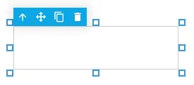
States - the list of defined states. Use the green button to add a new state:
State properties
Section titled “State properties”Trigger - Chooses the trigger value for the state. If set to Value, the HMI will compare the value received through the States variable against the provided numeric value. If set to Variable, it will evaluate the variable value and compare it against the States variable value. If the two values are equal, the component will switch to this state.
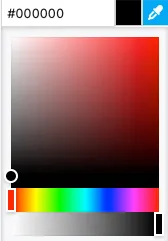
Background color - the background color of the component. A hex value can be input in one the formats:
#RRGGBB#RRGGBBAA#RGB#RGBA
Where:
R=red color componentG=green color componentB=blue color componentA=alpha (transparency) component
Alternatively, the integrated color picker can be used to visually pick a color:
Border color - the color used for the header border.
Opacity - controls the transparency of the component.
Behavior - allows special behavior in the specified state:
none- no special behavior (component is rendered normally)blink- the component will blink periodicallydisabled- the component is rendered as disabled and will not respond to mouse or keyboard interactionhide- the component is completely hidden
The style properties define the default look and feel of the component (i.e. no state is active or defined).
Background color - the background color of the component. A hex value can be input in one the formats:
#RRGGBB#RRGGBBAA#RGB#RGBA
Where:
R=red color componentG=green color componentB=blue color componentA=alpha (transparency) component
Alternatively, the integrated color picker can be used to visually pick a color:
Background image - the background image. If no image is provided, the component is rendered with it’s default look.
Background Size - the handling of the background image with regard to the size of the component (default is Auto):
Auto- Displays the image without any scalingCover- Stretches the image to cover the entire componentContain- Stretches the image to fit inside the component
Border color - the color used for the header border.
Shadow - allows specifying a component shadow using the built-in shadow editor:
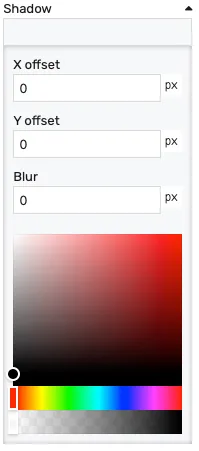
X offset- the shadow horizontal offset in pixels (can be negative)Y offset- the shadow vertical offset in pixels (can be negative)Blur- the shadow blur radius. A higher value results in a blurrier shadow, while a lower value will result in a more sharp shadow.Color picker- the shadow color
Opacity - controls the transparency of the component.
Position
Section titled “Position”Height - the height of the panel in pixels
Layout
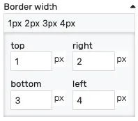
Section titled “Layout”Border width - controls the width of the border on each side. Values can be manually input as:
<top>px <right>px <bottom>px <left>px<top_bottom>px <left_right>px<all>px
Alternatively, the built-in border editor can be used for a visual input:
Collapse button position - if the Is collapsible option is set, it will display a button to expand/collapse the header. This property controls the positioning of the button
Is collapsible - toggles the display of the collapse/expand button.