Grid
The Grid component arranges its children into a fixed grid of rows and columns. Unlike a Flexbox, where children are sized by their own properties and the container only controls flow, a Grid divides its available area into uniformly-sized cells and places one component per cell. Cells can also be merged to span multiple columns or rows, and split back into the original tracks. This makes Grid the right choice for HMI layouts that need a structured, tabular alignment such as machine dashboards, KPI tiles, or label/value pairs.
Use the Panel when you need a simple background container, Flexbox for free-flow horizontal or vertical stacking, and Grid when you need a strict two-dimensional alignment.
Adding a Grid
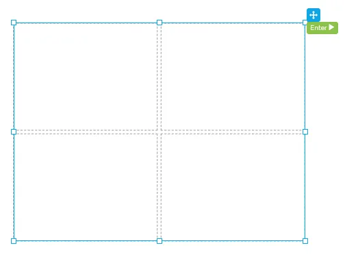
Section titled “Adding a Grid”Drag the Grid component from the palette onto the canvas. The grid is created with a default layout of 2 columns × 2 rows and 4 empty cells, separated by a small gap. Resize the grid like any other component — the cells stretch proportionally.
A Grid only accepts cells as direct children; you cannot drop arbitrary components onto the grid itself. Each cell is itself a container that accepts any HMI component.
Selecting a cell
Section titled “Selecting a cell”Click on an empty cell in the canvas, or expand the grid in the Layers panel and pick a cell from there. Cells are not draggable and cannot be moved or resized directly — their geometry is governed by the parent grid’s columns, rows, and the cell’s own spans.
Placing components in a cell
Section titled “Placing components in a cell”With a cell selected, drag any component from the palette onto it, or drop a component onto the cell directly. To re-arrange components later, move them between cells in the Layers panel.
Merging and splitting cells
Section titled “Merging and splitting cells”When a cell is selected, the Configuration section of the properties panel shows a Cell Actions block with six buttons:
Merge Left/Merge Right- extend the current cell into the neighboring cell on that side. The neighbor is absorbed and its contents are removed.Merge Up/Merge Down- same as above, vertically.Split H- splits a horizontally-merged cell back into its original columns. Available only when the cell already spans more than one column.Split V- splits a vertically-merged cell back into its original rows. Available only when the cell already spans more than one row.
Merge buttons are disabled when there is no neighbor available in that direction (edge of grid, or the neighbor itself spans into another area). When a cell spans more than one column or row, a small Span: X cols x Y rows indicator is shown below the action buttons.
Features
Section titled “Features”Configuration
Section titled “Configuration”Columns - the number of columns the grid divides itself into. Valid range is 1–20. Changing this value adjusts the cell layout immediately.
Rows - the number of rows the grid divides itself into. Valid range is 1–20. Changing this value adjusts the cell layout immediately.
Gap (px) - the spacing in pixels between cells, both horizontally and vertically. Valid range is 0–100.
The style properties define the look of the grid container itself. Cell appearance is configured separately on each cell — see Cell properties below.
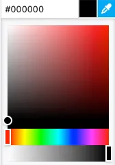
Background color - the background color of the grid container, visible in the gap between cells. A hex value can be input in one the formats:
#RRGGBB#RRGGBBAA#RGB#RGBA
Alternatively, the integrated color picker can be used to visually pick a color:
Border color - the color of the grid’s outer border.
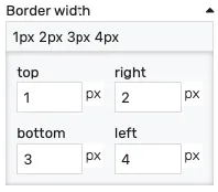
Border width - controls the width of the outer border on each side. Values can be manually input as:
<top>px <right>px <bottom>px <left>px<top_bottom>px <left_right>px<all>px
Alternatively, the built-in border editor can be used for a visual input:
Position
Section titled “Position”The position section contains properties which affect the position and size of the grid. These can be changed by dragging and resizing the component with the mouse, or directly, by manually entering the values:
Left - distance from the left edge in pixels
Top - distance from the top edge in pixels
Width - component width in pixels
Height - component height in pixels
Placement
Section titled “Placement”The placement section controls the placement and stretching of the grid:
Placement - the placement of the component:
Absolute- the component will have fixed coordinates and sizeStretch horizontal- uses fixed vertical position and stretches the contents horizontallyStretch vertical- uses fixed horizontal position and stretches the contents verticallyStretch- stretches the contents both horizontally and verticallyPin left- pins the contents to the left of the page, while keeping its sizePin middle- pins the contents to the middle of the page, while keeping its sizePin right- pins the contents to the right of the page, while keeping its sizePin top- pins the contents to the top of the page, while keeping its sizePin bottom- pins the contents to the bottom of the page, while keeping its size
Offset left - the left offset when using any placement except Absolute
Offset top - the top offset when using any placement except Absolute
Offset bottom - the bottom offset when using any placement except Absolute
Offset right - the right offset when using any placement except Absolute
Cell properties
Section titled “Cell properties”Each cell can be configured individually by selecting it in the canvas or in the Layers panel.
Configuration
Section titled “Configuration”Cell Actions - the merge and split controls described under Merging and splitting cells.
Background color - the background color of the cell. A hex value can be input in one the formats:
#RRGGBB#RRGGBBAA#RGB#RGBA
Alternatively, the integrated color picker can be used to visually pick a color:
Border color - the color used for the cell border.
Border width - controls the width of the cell border on each side. Values can be manually input as:
<top>px <right>px <bottom>px <left>px<top_bottom>px <left_right>px<all>px
Alternatively, the built-in border editor can be used for a visual input: