Polyline
The Polyline component renders a free-form line made of two or more points. It supersedes the legacy Line component: any straight or stepped shape that Line could produce can be reproduced with a Polyline, plus arbitrary multi-segment paths and closed shapes.
Adding a polyline
Section titled “Adding a polyline”Unlike palette components, the Polyline is not dragged onto the canvas — it is drawn. In the palette sidebar, click the Draw polyline tool, then place points on the canvas:
- Click on the canvas to add a point.
- Double-click or press Enter to finish the polyline.
- Backspace removes the last placed point.
- Escape cancels drawing.
After finishing, the new polyline behaves like any other component (it can be moved, resized, restyled, given states).
To change the geometry of an existing polyline later, select it and click the Edit polyline points tool in the palette sidebar. Drag individual points, or click an edge to add a new point.
Features
Section titled “Features”Configuration
Section titled “Configuration”This section controls the geometry and behavior of the polyline:
Line width - the stroke width (thickness) of the line in pixels.
Line style - the line drawing style:
solid- continuous linedashed- dashed segmentsdotted- dotted segments
Spacing - the gap between dashes or dots, in pixels. Only visible when Line style is dashed or dotted.
Corner radius - rounds the corners where two segments meet. A value of 0 produces sharp corners.
Closed path - if checked, the last point is connected back to the first one, producing a closed shape that can be filled with a background color.
States
Section titled “States”This section allows defining condition-based visual states. These can be used to alter the look based on external factors.
States variable - the runtime variable which is used to evaluate the state. The value of this variable is compared against the value of each state to decide which is the active state. If no match is found, the component will be displayed using its default values.
Test value - this is a test value that can be used to change the active state at design time. It simulates receiving the test value as the state variable value.
States - the list of defined states. Use the green button to add a new state:
State properties
Section titled “State properties”Trigger - Chooses the trigger value for the state. If set to Value, the HMI will compare the value received through the States variable against the provided numeric value. If set to Variable, it will evaluate the variable value and compare it against the States variable value. If the two values are equal, the component will switch to this state.
Border color - the color used for the polyline stroke.
Background color - the fill color, used only when Closed path is enabled.
Opacity - controls the transparency of the component.
Behavior - allows special behavior in the specified state:
none- no special behavior (component is rendered normally)blink- the component will blink periodicallydisabled- the component is rendered as disabled and will not respond to mouse or keyboard interactionhide- the component is completely hidden
The style properties define the default look and feel of the polyline (i.e. no state is active or defined).
Border color - the color used for the polyline stroke. A hex value can be input in one the formats:
#RRGGBB#RRGGBBAA#RGB#RGBA
Where:
R=red color componentG=green color componentB=blue color componentA=alpha (transparency) component
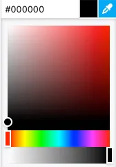
Alternatively, the integrated color picker can be used to visually pick a color:
Background color - the fill color, used only when Closed path is enabled. Set to none to keep the shape unfilled.
Shadow - allows specifying a component shadow using the built-in shadow editor:
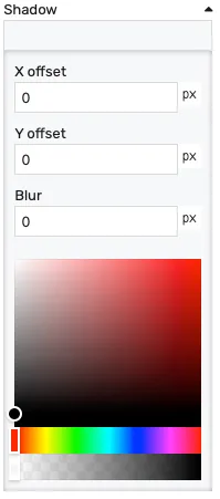
X offset- the shadow horizontal offset in pixels (can be negative)Y offset- the shadow vertical offset in pixels (can be negative)Blur- the shadow blur radius. A higher value results in a blurrier shadow, while a lower value will result in a more sharp shadow.Color picker- the shadow color
Opacity - controls the transparency of the component.
Position
Section titled “Position”The position section contains properties which affect the position and size of the bounding box around the polyline. These can be changed by dragging and resizing the component with the mouse, or directly, by manually entering the values. Resizing the bounding box scales the polyline points proportionally:
Left - distance from the left edge in pixels
Top - distance from the top edge in pixels
Width - bounding box width in pixels
Height - bounding box height in pixels