Navigation menu
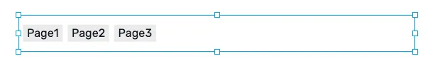
The Navigation menu renders a row or column of navigation buttons from a single editable list, instead of placing many individual Navigation Item components by hand. It also collapses automatically into a burger menu when there is not enough horizontal space, and can be configured to use a burger menu permanently.
Use a Navigation menu when you want a single styled menu (top bar, side bar, mobile nav). Use individual Navigation Item components when you need each button to be placed and styled independently.
Features
Section titled “Features”Configuration
Section titled “Configuration”Items - the list of navigation entries. Each entry has:
Target page- the HMI page to navigate to when the item is clicked.Label- optional override for the button text. If left empty, the page name is used.Visible- if unchecked, the entry is kept in the list but hidden at runtime. Useful for conditionally exposing items via versioning or work-in-progress pages.
Items can be reordered by dragging, and added or removed with the row controls.
The style properties define the default look and feel applied uniformly to every item.
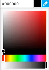
Background color - the background color of the navigation container itself. A hex value can be input in one the formats:
#RRGGBB#RRGGBBAA#RGB#RGBA
Alternatively, the integrated color picker can be used to visually pick a color:
Item background - the background color used for each item in its default state.
Item text - the text color used for each item label.
Item border - the color used for each item’s border.
Shadow - allows specifying a container shadow using the built-in shadow editor:
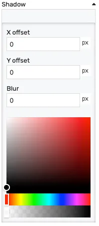
X offset- the shadow horizontal offset in pixels (can be negative)Y offset- the shadow vertical offset in pixels (can be negative)Blur- the shadow blur radius. A higher value results in a blurrier shadow, while a lower value will result in a more sharp shadow.Color picker- the shadow color
Opacity - controls the transparency of the component.
Interactions
Section titled “Interactions”These properties define how each item reacts to the user.
Hover background - the item background color while the cursor is over it.
Hover text - the item text color while the cursor is over it.
Hover border - the item border color while the cursor is over it.
Active background - the item background color when the item targets the current page. Active detection follows the same rules as Navigation Item — page match, placeholder match, or shared navigation tag (see HMI Navigation).
Active text - the item text color in the active state.
Active border - the item border color in the active state.
Layout
Section titled “Layout”Direction - lays the items out either:
Horizontal- items rendered in a rowVertical- items rendered in a column
Gap - spacing in pixels between items.
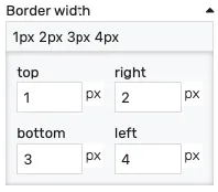
Item border - controls the width of each item’s border on each side. Values can be manually input as:
<top>px <right>px <bottom>px <left>px<top_bottom>px <left_right>px<all>px
Alternatively, the built-in border editor can be used for a visual input:
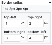
Item radius - the corner radius applied to each item. Values can be manually input as:
<top-left>px <top-right>px <bottom-left>px <bottom-right>px<left>px <right>px<all>px
Alternatively, the built-in border radius editor can be used for a visual input:
Item padding - the inner padding of each item.
Typography
Section titled “Typography”Item font - the font size used for the item labels.
Burger menu
Section titled “Burger menu”A Navigation menu supports two ways of presenting items as a burger menu:
- Auto-burger - the menu watches its container width and automatically collapses into a burger button when the items no longer fit. This is on by default and requires no configuration; simply set the container to the desired width.
- Manual burger - explicitly switches the menu to burger mode regardless of available width. This is useful for mobile resolutions or for navigation patterns that should always start collapsed.
When the menu enters burger mode, the editor automatically creates and links a Burger Menu sibling node that hosts the drop-down panel. Style the drop-down by selecting that linked burger menu node — it inherits the menu’s items by default.
To toggle between manual burger mode and the inline layout, use the Open action in the selection overlay that appears when the Navigation menu is selected on the canvas.
Placement
Section titled “Placement”The placement section controls the placement and stretching of the component:
Placement - the placement of the component:
Absolute- the component will have fixed coordinates and sizeStretch horizontal- uses fixed vertical position and stretches the contents horizontallyStretch vertical- uses fixed horizontal position and stretches the contents verticallyStretch- stretches the contents both horizontally and verticallyPin left- pins the contents to the left of the page, while keeping its sizePin middle- pins the contents to the middle of the page, while keeping its sizePin right- pins the contents to the right of the page, while keeping its sizePin top- pins the contents to the top of the page, while keeping its sizePin bottom- pins the contents to the bottom of the page, while keeping its size
Offset left - the left offset when using any placement except Absolute
Offset top - the top offset when using any placement except Absolute
Offset bottom - the bottom offset when using any placement except Absolute
Offset right - the right offset when using any placement except Absolute