Grid
The grid component allows placing elements in a grid (tabular) layout. The grid is composed of rows and cells.
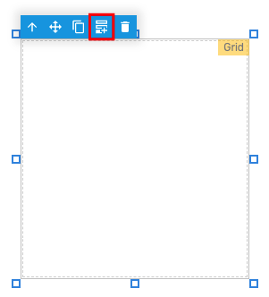
Adding rows to the grid
Rows can be added to the grid by using the component selection frame button as indicated below:
Adding cells to a grid row
To add cells to a grid row, the row must be selected first from the Layers area:
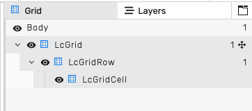
Once, selected, the component selection frame will indicate that a row is selected and the add cell button can be used to add a new cell:

Placing elements in the grid
The easiest way to place elements in the grid is by selecting the cell from the Layers area and then dragging and dropping the element on the grid. Misplaced elements can be moved in the layers area to the appropriate grid cell.
Grid properties
States
This section allows defining condition-based visual states for the button. These can be used to alter the look of the button based on external factors.
States variable - the runtime variable which is used to evaluate the state. The value of this variable is compared against the value of each state to decide which is the active state. If no match is found, the component will be displayed using its default values.
Test value - this is a test value that can be used to change the active state at design time. It simulates receiving the test value as the state variable value.
States - the list of defined states. Use the green button to add a new state:
State properties
Trigger - Chooses the trigger value for the state. If set to Value, the HMI will compare the value received through the States variable against the provided numeric value. If set to Variable, it will evaluate the variable value and compare it against the States variable value. If the two values are equal, the compoent will switch to this state.
Background color - the background color of the component. A hex value can be input in one the formats:
#RRGGBB#RRGGBBAA#RGB#RGBA
Where:
R=red color componentG=green color componentB=blue color componentA=alpha (transparency) component
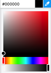
Alternatively, the integrated color picker can be used to visually pick a color:
Border color - the color used for the component border.
Opacity - controls the transparency of the component.
The opacity and background alpha component both affect the transparency of the component, but have different behaviors. The opacity affects the whole component, while the background alpha affects only the background transparency.
Behavior - allows special behavior in the specified state:
none- no special behavior (component is rendered normally)blink- the component will blink periodicallydisabled- the component is rendered as disabled and will not respond to mouse or keyboard interactionhide- the component is completely hidden
The hide behavior is different than using an opacity of 0. A hidden component will not receive any mouse or keyboard interaction, instead any component below it will receive them. On the contrary, a component with 0 opacity (fully transparent) still exists on the layout and will receive mouse or keyboard interactions.
Style
The style properties define the default look and feel of the component (i.e. no state is active or defined).
Background color - the background color of the component. A hex value can be input in one the formats:
#RRGGBB#RRGGBBAA#RGB#RGBA
Where:
R=red color componentG=green color componentB=blue color componentA=alpha (transparency) component
Alternatively, the integrated color picker can be used to visually pick a color:
Border color - the color used for the component border.
Position
The position section contains properties which affect the position and size of the component. These can be changed by dragging and resizing the component with the mouse, or directly, by manually entering the values:
Left - distance from the left edge in pixels
Top - distance from the top edge in pixels
Width - component width in pixels
Height - component height in pixels
Layout
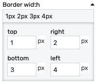
Border width - controls the width of the border on each side. Values can be manually input as:
<top>px <right>px <bottom>px <left>px<top_bottom>px <left_right>px<all>px
Alternatively, the built-in border editor can be used for a visual input:
Placement
The placement section controls the placement and stretching of the contents:
Placement - the placement of the component:
Absolute- the component will have fixed coordinates and sizeStretch horizontal- uses fixed vertical position and stretches the contents horizontallyStretch vertical- uses fixed horizontal position and stretches the contents verticallyStretch- stretches the contents both horizontally and verticallyPin left- pins the contents to the left of the page, while keeping its sizePin middle- pins the contents to the middle of the page, while keeping its sizePin right- pins the contents to the right of the page, while keeping its sizePin top- pins the contents to the top of the page, while keeping its sizePin bottom- pins the contents to the bottom of the page, while keeping its size
Offset left - the left offset when using any placement except Absolute
Offset top - the top offset when using any placement except Absolute
Offset bottom - the bottom offset when using any placement except Absolute
Offset right - the right offset when using any placement except Absolute
Grid row properties
Additional to configuring the grid itself, each row can be individually configured by selecting it in the Layers area:
Configuration
Height - when set, it will force the grid row to have a fixed height. If unset, the grid row adjusts itself automatically.
Style
Background color - the background color of the row. A hex value can be input in one the formats:
#RRGGBB#RRGGBBAA#RGB#RGBA
Where:
R=red color componentG=green color componentB=blue color componentA=alpha (transparency) component
Alternatively, the integrated color picker can be used to visually pick a color:
Border color - the color used for the row border.
Layout
Border width - controls the width of the border on each side. Values can be manually input as:
<top>px <right>px <bottom>px <left>px<top_bottom>px <left_right>px<all>px
Alternatively, the built-in border editor can be used for a visual input:
Grid cell properties
Grid cells can also be configured individually, by selecting them.
Configuration
Align content - controls the alignment of the content with regard to the grid cell (Left / Center / Right)
Display - controls the display of the elements inside the grid cell:
Inline- places the components horizontallyVertical- places the components vertically
Flex - the size multiplier of the cell. The row width is divided evenly between the cells. A value of 1 means that a cell ocuppies the normal size of one subdivision. A value of 2 means that the cell occupies twice the size of the subdivision. The remaining cells will be shrinked and evenly distributed between the remaining horizontal space.
Style
Background color - the background color of the row. A hex value can be input in one the formats:
#RRGGBB#RRGGBBAA#RGB#RGBA
Where:
R=red color componentG=green color componentB=blue color componentA=alpha (transparency) component
Alternatively, the integrated color picker can be used to visually pick a color:
Border color - the color used for the row border.
Layout
Border width - controls the width of the border on each side. Values can be manually input as:
<top>px <right>px <bottom>px <left>px<top_bottom>px <left_right>px<all>px
Alternatively, the built-in border editor can be used for a visual input:
Padding: Distance from the border to the inner contents in pixels.